Top Responsive Web designing Services
Geoxis offers Responsive Web designing is the approach that suggests that design and development should respond to the user’s behavior and environment based on screen size, platform and orientation.

Best Responsive Website Design Company
We as Responsive Web Designing Company, implement responsive web design feature which help business and customer. Go beyond the traditional web boundaries to explore an existing world where the designs will fit every browser-operated gadget.
- Web Design
- UI/UX Design Trends
- Digital Solutions
- Workflow Automation
- Easy Setup
- Testing & Support

Components of Responsive Design
Responsive website design consists of the following three main components.
Interested? Let's get in touch!
With the growth in mobile Internet usage comes the question of how to build websites suitable for all users. The industry response to this question has become responsive web design, also known as RWD.
Clients Testimonials
Portfolio

Samaj Sevak Party
We at Geoxis helps Samaj Sevak Party to develop online presence. We had design and […]
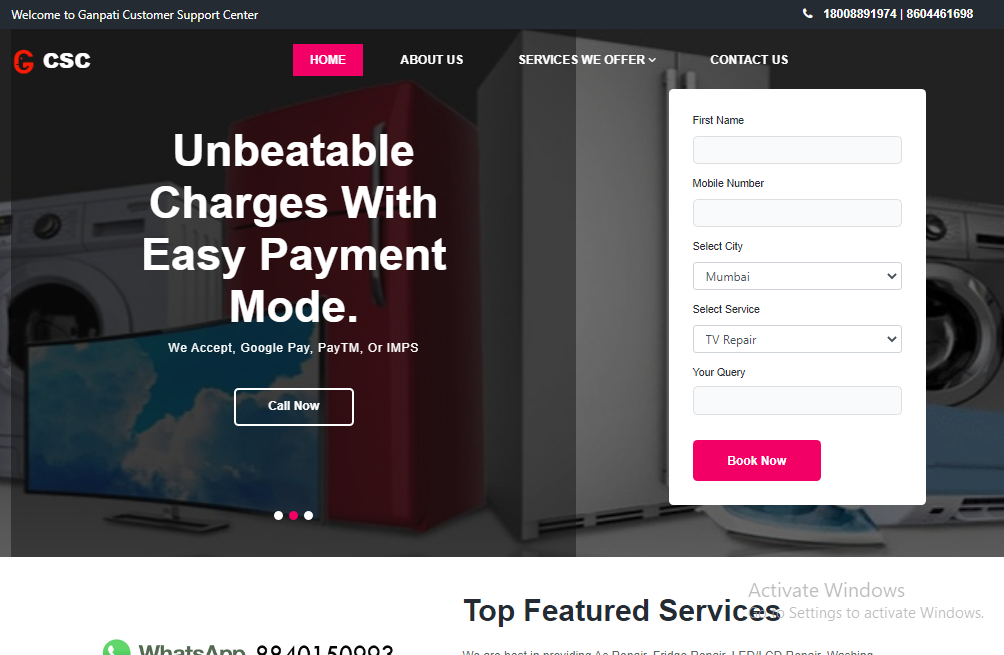
Ganpati Customer Support Center
ClientGanpati CSCProjectLead GenerationProjectThe Team of Geoxis helps, Ganpati CSC to generate lead in Repairing sector [...]
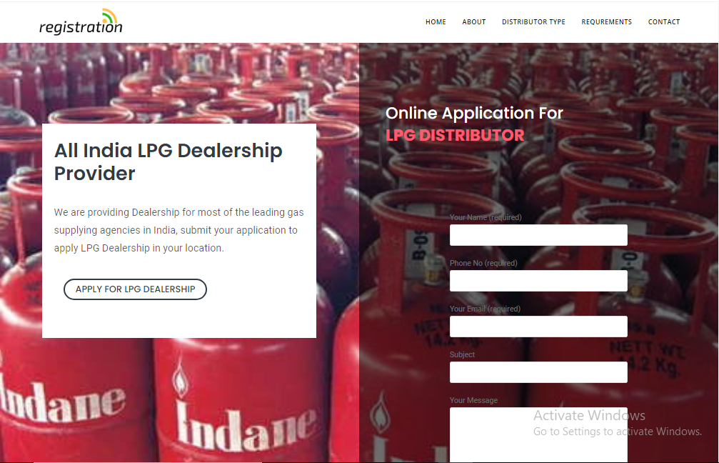
All Agency Dealership
ClientAll Agency DealershipProjectWebsite Development and Lead GenerationProjectThe Team of Geoxis had developed the landing page [...]
Blog
Do You Have Questions?
A list of frequently asked questions to help you understand how it works.
1. What is responsive web design?
Responsive Web design is the approach that suggests that design and development should respond to the user’s behavior and environment based on screen size, platform and orientation. The practice consists of a mix of flexible grids and layouts, images and an intelligent use of CSS media queries.
2. Why is responsive design important?
- It improves usability and readability on mobile devices. More and more people are using a mobile device to browse the web.
- The content providers don’t need to feed two different sites because the mobile and desktop are the same.
- It’s recommended by Google in order to improve SEO.
3. What is the difference between responsive and adaptive web design?
Response web design adapts to the size of the screen no matter what the target device screen size is. The layout is ‘fluid’ and uses CSS media to change styles, this ‘fluid’ grid enables the page to resize its width and height to adapt to different screen sizes and show correctly.
4. What are responsive Web applications?
Responsive web design (RWD) is an approach to web design that makes web pages render well on a variety of devices and window or screen sizes. Content, design and performance are necessary across all devices to ensure usability and satisfaction.
5. What is mobile responsive design?
When a website is responsive, the layout and/or content responds or adapts based on the size of screen they are presented on. A responsive website automatically changes to fit the device you’re reading it on.
6. What is the benefit of responsive design?
A responsive website has a fluid and flexible layout which adjusts according to screen size. The importance of responsive web design is that it offers an optimized browsing experience. Basically, your website will look great and work well on a desktop (or laptop), a tablet, and a mobile phone’s browser.