The Best 7 Mobile SEO Tips You Shouldn’t Miss

SEO means “Search Engine Optimization” and it is a sector of Online Marketing that deals with all measures to improve the positioning of a site in search engine results. Even the optimization for mobile devices (Mobile SEO) has become an essential part of SEO strategy in time.
If you are organizing an online business or want to start in the digital universe, learning how to generate organic traffic through SEO, advice is essential to have resulted in the medium and long term. With this method, in addition to avoiding excessive expenses with paid advertising, you can guarantee the longevity of your project, be it a physical or virtual business.
Working with well-structured SEO optimization also ensures that more people find you through search engines and allow your company to compete for the top positions against the terms that your consumers use to find your product or service.
Mobile SEO
Mobile SEO refers to website search engine optimization combined with a seamless display on mobile devices such as smart phones and tablets. Thanks to the growing boom in handheld devices, webmasters must be very keen on mobile SEO planning. After all, more than 50% of Internet users report that they browse the Internet daily through their mobile devices. Google already supports sites optimized for mobile devices.
Drawing on various mobile SEO projects’ experience, we have created this detailed guide on mobile SEO. We hope it helps newcomers to find out some miss out key issues of mobile SEO. The following are recommendations to help you better understand how to properly optimize your website for the best user experience on all mobile devices.
It is possible to use this optimization process in the content and through the configuration of your website.
Thus generating a greater possibility of working SEO for eCommerce and physical businesses.
Now, if you want to learn how to use this concept in practice, stay with us until the end of the content and take the opportunity to learn 07 mobile SEO tips to give rise to more traffic to your website.
What is SEO?
SEO is an abbreviation in English for “Search Engine Optimization”. Basically, SEO is a set of techniques to help your pages on the Internet, whether they are blogs, virtual stores, or landing pages, to perform better in search engines, such as Google.
This set of techniques allows search engine algorithms to identify which topics your content addresses more clearly. Thus, they can better classify these contents and display them on the results page, or SERP, when they perform a search. Mobile SEO can be defined as a website optimization for use on mobile devices such as phones and tablets.
This means optimizing the spider website’s content for search engines to ensure that the content is indexed and ranked. A whopping 96% of mobile searches are done with Google, and Google prioritizes the Mobile-First index. In short, if you want to get ranked, it is imperative to follow their recommendations for mobile SEO.
It is clear that if your web traffic comes mostly from mobile devices, such as smartphones or tablets, it will be necessary to position your website, taking this into account. Besides, it will influence many aspects of your page:
Mobile experience:
User experience is one thing that Google takes into account the most and values it independently on each of the devices.
Web traffic:
More than half of the web traffic that reaches the search engine does so from mobile devices, so not being well optimized in this sense will prevent users from finding you.
Positioning Change:
Good SEO for mobile phones will help you get many visits from these devices, which will also influence your positioning for them.
Most of the searching is done on mobile phones, and it’s time to implement a mobile SEO strategy. Here are seven tips you need to get started
Today, your online marketing campaign needs to target mobile users. Our highly connected world has enabled people to search and view websites on the go from various devices.
It means that if your website isn’t optimized for mobile use, you’ll lose leads and conversions. Non-optimized mobile sites also drop search engine rankings.
The good news is that it’s easy to optimize your site. Keep reading 7 Mobile SEO Tips to Raise Your Site Awareness.
1. Determine The Mobile-friendliness of Your Site
Before you can decide the future direction of mobile SEO, you need to know where you are.
Google offers free tools to determine the mobile usability of your site. You can use this device to test all kinds of mobile elements, including:
- Using plug-in
- Viewport width
- Content sizing
- Use of flash
- Font size
- Placement of page elements
The results of the report can be used to shape the next move. Maybe you need to design your website again for smaller screen use. Alternatively, you may need to optimize your content and eliminate definite plug-in.
2. Use Responsive Design
The best mobile SEO tactic is to adopt a responsive design. This design approach addresses the user’s platform, screen size, and orientation. Similarly, your website is more likely to be loaded for more users.
The biggest problem with mobile sites is that the screen size keeps changing. With new phones and tablets released each year, you’ll have a hard time keeping up with dozens of screen sizes. Responsive design is comprehensive and provides the best experience for mobile users.
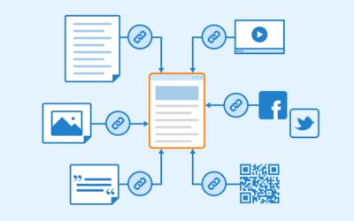
3. Participate In Social Media
The use of social media on mobile phones continues to grow. In fact, 80% of the time spent on social media comes from mobile devices.
If you want to raise awareness of your company, you need to participate in social media. This mobile SEO strategy allows you to interact with potential consumers while targeting your existing customers.
Use Facebook to share the company’s information and updates. Twitter is an ideal place to host a hashtag contest.
The important thing is to participate and stay involved. By participating in conversations and campaigns, you can keep your company’s name in place.
4. Focus on Page Load Time
In fact, mobile users expect the page to load within 3 seconds. After 3 seconds, 53% of users abandon the page.
Slow pages may be at the expense of your leads and conversions.
Here are some steps to take:
- Delete unused scripts
- Minimize HTTP requests
- File compression
- Enable browser cache
- Image optimization
- Page load time is an important factor in the success of your website.
5. Focus on Local Search
Local SEO is another key element of mobile optimization. Mobile device users often search for products and services in their area. This is your website needs to be optimized for local search.
One of the easy ways to do this is to include the state and city of its content. This contains Meta descriptions, title tags, and H1 headings. Apart from on-site content, off-site content is just as important.
To raise awareness of your company, create a Google My Business list. This is a free service that allows internet users to find your business, read customer reviews, and view images.
6. Optimized For Mobile Keyword Search
If you already have used content, such as your company’s blog, you may know the importance of keyword optimization. However, mobile keyword optimization is a little different.
The era of text-based Internet search has been put off. Instead, consumers are increasingly using voice-based search.
In fact, 41% of mobile users use voice search. It’s much convenient to ask Siri or Google to find a local store.
Mobile keyword optimization allows you to focus on keywords that are suitable for voice search. As consumers adopt more voice-launching technologies, website content needs to keep up.
To make your website more suitable for voice search:
- Optimize using conversational search queries
- Answer content questions
- Use structured data mark-up
- Create a FAQ page on the website
Voice search trends aren’t going away anytime soon. Your business will want to focus on voice search optimization to stay ahead of the competition.
7. Consider Using Accelerated Mobile Pages
Google’s Accelerated Mobile Pages (AMP) is a new initiative aimed at delivering faster mobile pages. These pages are no different from regular HTML web pages. The biggest difference is that the loading time is insanely fast. Using faster pages can significantly improve the user’s browsing experience.
Pages designed using AMP includes a simpler form of client-side script.
Is it possible to generate more organic traffic with SEO?
For those looking to improve their website’s performance, online store, or even their blog dedicated to affiliate marketing, investing in strategies to attract organic traffic with SEO optimization is the most effective way in the medium and long term.
Although the results of this process take a little longer to begin to appear, surely when they do, it is complicated that you do not have a positive result.
However, for this to happen gradually and functionally, you must stay focused on your work and avoid possible mistakes. And if you still don’t know what the main SEO mistakes are, we invite you to continue reading on the subject so that your experience within this universe is the best possible.
Responsive web design
Nowadays, more and more users surf the internet from their mobile phones or tablets, over and above the use they make of the computer. Let’s say that a cell phone works like a small computer that can be moved everywhere and in which practically people can carry out the same functions.
Considering this, it is important that our website responds to this demand and adapts to any device. The pages developed with a ‘responsive’ web design were designed mainly with this function.
Advantages of a responsive website
These are some of the most important advantages:
- It gives us the possibility of designing a particular web page for all devices. Avoid duplicating content and help improve SEO.
- The web page adapts to the person who is browsing it and provides many more tools for use.
- The site will recognize from which device it is being accessed. Therefore it will adjust all the content so that you can view it in a better way and move without any inconvenience.
- Having a responsive website will guarantee you cost savings.
SEO And Mobile Optimization
If we are owners of a website, the first thing we consider is to attract a greater amount of traffic to it. The main idea is to achieve a good web positioning, and this goes hand in hand with the trust that we generate in public.
Users will feel greater attraction and, above all, trust, for pages that they can visit directly from their mobile phone. SEO is partly based on the positive experience that we can create in people, and this type of design will be essential.
If what we want is to generate sales or achieve the contracting of the services we offer, the website will be our first contact with the client, and if it is successful, we will have already won a large part of the process. Mobile SEO optimizes your website to make it compatible with users who access it from mobile phones and tablets. This practice consists of finding the correct way to make the resources included in your page accessible to the search engines.
58% of searches performed on Google are made from a mobile device. This trend is growing faster and faster.
8. Advantages of Mobile SEO Those Are Key to Successful Website
Advantages of Mobile SEO:
1. Your SEO Score Will Increase
Google is currently using mobile scores as an SEO ranking factor. The bottom line is that if your website is slow and has a high bounce rate (see below), it won’t be ranked by keyword. If you don’t rank, your SEO score will be low and your traffic will be costly.
Web traffic is a potential habit, and losing customers can be expensive. Many other factors can help your website’s SEO ranking, such as the number of backlinks and traffic. However, ranking systems such as domain authorities are also emerging, so if you don’t deal with the mobile SEO situation right now, your competitors will.
2. Faster Page Speed
The faster the load time, the higher the SEO score. The main question is how to actually do it. Fortunately, there are several ways.
First, you can hire a developer to remove and clean up unwanted code on your site’s backend to enhance your online security. You can also create amp pages, optimized versions of your website, and pages. Finally, make sure your hosting is the best and fastest provider you can get.
3. Improve The User Experience
Websites optimized for mobile devices are designed to fit on a small screen. You don’t have the same fonts and menus that appear on your desktop web page because it’s difficult to navigate without a mouse. This can lead to frustration and make people leave the website.
Have you tried a website on your mobile that wasn’t designed for mobile devices? Find one and browse to see how frustrating it really is. An example of an impressive mobile experience is this legitimate website for creating payslips. It’s easy to navigate and clear.
4. Increase The Time Spent on The Site
Getting your customers to browse your website benefits you in two easy ways. The first is that the more you browse, the more connections you have with the company. This will increase your chances of making a purchase or committing to sign up.
The second reason is that it is added to the SEO score. Bounce rate estimates the amount of time a user spends on a website. If they appear and disappear quickly, it will harm your score. Efficient mobile websites improve this significantly.
5. Mobile SEO Costs Cheaper Than Apps
Application development is expensive. Increasing mobile SEO practices actually costs little. Therefore, you can enter the mobile market without spending a lot of money on app development.
6. Get More Business
I think services such as stores, transportation, delivery, and personal services are very intuitive. Grow your business through mobile-optimized layouts and simple, fast forms. Imagine this scene. I’m home, and I don’t feel like cooking tonight. Guess where I order the cap: from a funky website with a phone number hidden in a double dropdown menu, from your nice and neat website
7. Improved Accessibility
Need to list everything? Small fonts, elongated layouts, pinch, and scroll, etc. Not only do they affect users with disabilities, but they also annoy other users.
8. Lower Maintenance Cost
Mobile responsive websites can be a bit more expensive than prepaid, but they are much less expensive to maintain. You don’t have to reformat and duplicate content or add features twice like you would on a desktop or mobile website. The same is true for bug fixes and SEO campaigns.
Author Bio:
Chris is a passionate writer, hungry for new innovation. New trends fill him with tons of enthusiasm to uncover hidden topics. Speakaudible covers a wide range of subjects related to audiobooks. You can check best audiobook novels ever on Speakaudible.


The lateset mobiles is like here
https://www.infobrez.com/fashion-designing-softwar
Great Post. Visit Pavithran.Net!
thanks nice article
https://www.infobrez.com/Operations-management-software
https://www.infobrez.com/finance-management-software
A financial management system is the methodology and software that an organization uses to oversee and govern its income, expenses, and assets with the objectives of maximizing profits and ensuring sustainability
hello i have create mobile friendly site but google page speed checker is low how can reduce my speed…my site url is https://customernumbers.in/dream11-customer-care-number/
Most of the people do their searches in Mobile. So all the website should be mobile friendly. You have shared a good information to us.
https://www.railrecipe.com
Great tips bro!
https://emiratesids.com/
Comments are closed.